UI/UX Case Study: Climate Prediction Center (CPC)
- sudipta saha
- Apr 2, 2022
- 3 min read
This project explains the design thought process while analyzing the Climate Prediction Center website. I have not been commissioned to do so.
Overview of the Website:
Climate Prediction Center (CPC) (https://www.cpc.ncep.noaa.gov/) is a US Government website whose products are operational predictions of climate variability, real-time monitoring of climate, and the required databases, and assessments of the origins of major climate anomalies.

Why redesign this website?
Analyzing the Climate Prediction Center (CPC) website made me focus on the following:
1. Across Site: Problems like navigation, responsiveness, design layout, etc.
2. Page-Specific Issues
Analysis:
Problems and Solution:
Across site Problems:
Intrasite Search
An intrasite search is missing. There is no way to search across the website for any information presented on this data-driven website.
Search will initially present the following screen:

Responsiveness and design layout
This site is not responsive in terms of devices.
b. The data is getting out of the frame because of the resolution.

c. Margin and padding are missing on all the pages.

d. There are 2 logos in both the extreme ends at the top of the site. Both navigate to different pages, none of them being the home page.
NOAA (National Oceanic and Atmospheric Administration) redirects to Noaa.gov

The National Weather Service logo redirects to weather.gov.

e. The heading of the site is not clickable and does not take you to the home page as one would expect.
This site map data can be remodeled.
Solution:
We can use accordion and pagination for arranging the data.
Design Example -1

Design Example -2

f. This site does not follow the government-issued design standards. For example, Use design tokens, like $theme-grid-container-max-width: 'desktop', directly to set the value of settings variables in the theme settings files. Link: Design tokens | U.S. Web Design System (USWDS) (digital.gov)
g. The vertical navigation changes when navigating to a selection. Different pages have different vertical navigations.


Navigation:
In vertical navigation, only Climate - Weather is clickable. All the other categories show different behavior in which they are not clickable.
There is inconsistency in the breadcrumbs implemented for the following pages:
Outlooks to the Verification page.

For crosscutting themes > International Desks, the breadcrumbs are not functional.
For crosscutting themes > Ocean Climate, there is no navigation to the home page. The breadcrumbs are missing.

The "Partnerships page" which sub categorizes the NOAA partners page, is unreachable from the home page. The way to reach Partnership’s page is to reach the NOAA page and then go back to the Partnerships page via the breadcrumb.
Data Management:
This website presents a lot of technical data in a very complex and confusing way. According to the law-of-prägnanz, the user would be able to grasp more when the content is presented simply and clearly. Law of Prägnanz | Laws of UX
Solution:
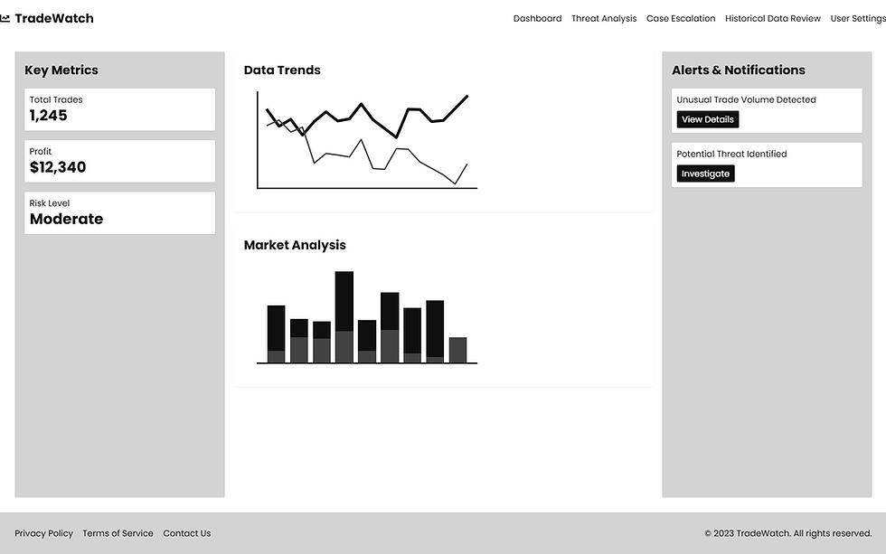
The pages which have a lot of links should be categorized in the following way and there should be pagination used in terms of populating a particular DOM element on the screen. The below image is just an example to show data management.

Page-Specific Issues:
Home Page
a. The horizontal navigation has acronyms that do not provide any way to figure out what they stand for.
Solution:
At least, a tooltip providing the full form would be helpful. Also, all these can be better categorized under a separate section in the vertical navigation.

b. There is only Facebook integration. There can be more social media integrations.
c. The notification which is shown in bullet points can be presented in a better way.
Solution:
The notification can be presented in a banner. Also, Push notifications can be used to get the latest updates.
Monitoring and Data Page
a. Products Page: On the Monitoring of Data page, the content is out of position.

b. Background color is dark enough for the font to not be legible. This is caused because of the resolution of the page.
Solution: Use a light background for a dark colored font or vice versa.

Partnerships Page
a. Partnerships > Joint Agricultural Weather Facility (JAWF):
This page has a design that is inconsistent with the rest of the site.
This page has no breadcrumbs for navigation.
There appears a section with a "Climate Prediction Center" label rendered vertically with no meaningful information being conveyed. Also, it doesn't add to the aesthetics of the site because of the inconsistency and the inappropriateness.

b. Partnerships > Alaska Region:
The information on this page can be presented in a much more interesting way.

Outreach Page
a. This page is navigationally orphan to the home page. The way to reach the Outreach page is to backtrack from the breadcrumb of its children's pages.
Glossary:
a. This page can certainly make use of pagination rather than presenting all the information in a single long page with a scrollbar.

Meeting
a. Data management is not done properly.

About us:
a. About us is not clickable. Also, there are 3 dead links viz.(Welcome, Operational Prediction Branch, Operational Monitoring Branch)


Comments